SNERX.COM/SNUX Last Updated
2025/4/10 • Read Time 11min • Discord
______________________________________________________________________________________
Art is not subjective. From architecture to graphic design, visual art to music, the more you learn about how to do something the more you learn that there are right and wrong ways to do it. I believe that anyone sufficiently well-versed in both arts and math would tell you that math is more subjective than art. This page is about the right ways to do the objective work of art.
Design Principles
Plaintext Accessible
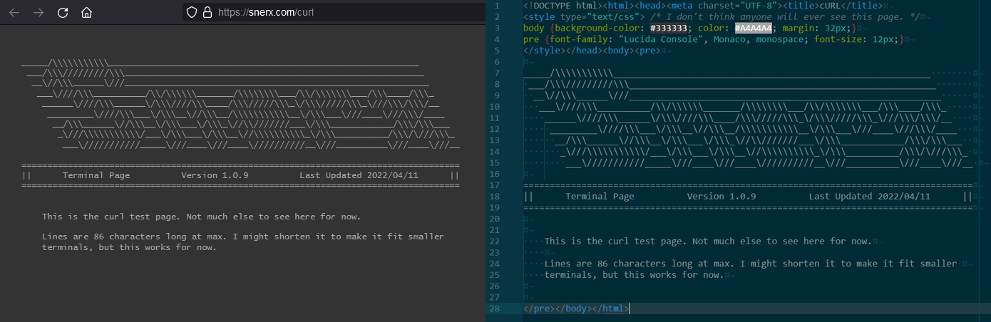
All interfaces are setup in such a way as to be easily readable in plaintext format in a terminal. This is to ensure that reading content in raw format will still render it properly and in an immediately-sensible modality. This also ensures that content will render properly on small screens, with 90 characters or less being the target width. An example of this is the /curl page.
Max Depth Two
All content is only ever one layer deep. This means that all category of content in a system and all particular pages for all content are all listed at the most superficial layer of the system (e.g. the Snerx landing page lists all relevant site pages with immediacy). All relevant content is accessible from the entry-level of the system and any selected content in the second layer gives full access to that topic/project. The exceptions to this on Snerx are pages with UI experiments.
Standalone Integrity
All content must be accessible as stand-alone files. Snerx uses inline CSS so as to make all pages self-contained and downloadable to be viewed offline. All systems must adhere to this principle: be made portable, optimized, compressed, and self-contained. I've heard people say there are rare cases where this is not possible and then proceed to describe a case in which it is very much possible. Portability and internal optimization will always be useful to anyone that wants to regularly use the system. This also mildly helps combat issues of linkrot by distributing copies of the source; this works better in very long-term scenarios than standard archival services like Perma.cc, WebCite, Hiberlink, timetravel, and Internet Archive because anybody can take a fully-functioning copy of the source with them rather than having to rely on web connectivity.
Standards Compliance and Compatibility
Trying to ensure ubiquity of availability and usability of a system is difficult, but regular review of the code can make a system fit for most environments. An additional code validator and automated regulation or conditioning of documents makes this process much easier. For example, the Snerx webserver uses validator.nu/web.dev to check for standards compliance (and when to break compliance) and a dead link checker for reports regarding site usability. It's also good to check WCAG/accessi compliance, contrast, and color blindness. On this, fonts and readability are also worth checking.
Minimalism
In order to fit as much information as possible into a space and have the space still be easily parsed by the human eye, it must not look busy or cluttered (RIP FUIs). This is easy to acheive by removing unneeded decorations around focused content like borders, frames, outlines, shadows, dividers, and even color-coded backgrounds. Standardized spacing between all sections, bodies, and workspaces is more than enough for segmenting content and partitioning your visual real estate. Reduction of an interface will always increase its ease of use so long as you don't reduce the useful bits away. To clarify, modifying text/content directly will work as stronger signifiers than making your signifiers separate objects. Minimal interfaces are absolutely required for the vast majority of humans to be able to use the interface at all.
Two Color Schemes For Two Optimal Functions
While Snerx has multiple color schemes, there are two in particular that should be implemented into critical systems. One is for optimal visibility in all environments and for all screens including damaged or low-light screens; this is always grayscale with black in the background, white in the foreground, and mid-tone grays as highlights. This is the highest contrast scheme possible, tied with a white background and black foreground, however bright-white backgrounds are very damaging and stressful on human eyes over long periods of time, so dark backgrounds are safer. The second scheme is for obscuring information on a screen; a light flat-tone color scheme. Desaturating the image should return all the same values of gray. This acts as a screen-mask and stops people from being able to easily read the information from a distance. An unfinished example of the latter is shown here.
Comparative Analysis
There is a lot I want to say about code
bloat and bad design
choices, but there is nothing substantial I could say that hasn't already been
said better by Casey Muratori in his talk
The Thirty Million Line
Problem. Generally, minimalism is the correct design choice for underlying
code, and this means it will be preferable for systems design as well.
So, as an analysis of code efficiency and hyper-minimalism, I compared snerx.com's landing page source code to gwern.net's on 2022/4/11. As a caveat for fairness, snerx.com is coded by hand and gwern.net is made using an HTML generator, which will always be less efficient, but the results are interesting either way.
Gwern's site has 3,465 lines of code in the header alone, all to contain otherwise minimal in-line CSS and a handful of scripts for things like link previews inside tooltips. Gwern's site then spends another 1k+ lines to lay out the tables for links to his other pages, bringing it to a whopping 4,895 lines of code total.
Conversely, Snerx's site has only 75 lines of code in the header, containing all the CSS and animations. Snerx's site then spends only 23 lines of code for all the content on the page including the table of links (which does not even require table tags), bringing it to a total of 98 lines of code, and there are 18 comment lines for some skiddie ASCII art that could be removed if you wanted to make it even more compact.
For the same form of content, with similar functionality (modulo gwern's link preview tooltips), snerx.com is 2% the size of gwern.net, or 50 times more efficient (49.95 times, precisely), making it more than an order of magnitude more optimized.
Coding a website by hand will always be better than relying on clunky and bloated frameworks, and while I will never be able to make a single-packet webpage like Yan Zhu did, I have been able to make every single page on Snerx human-readable even when the webpage doesn't render at all. As demonstration, below is an image of a browser render and the raw source next to it. It might even be easier to read as raw source. Using the underutilized 'pre' tag instead of normal 'h', 'p', and table tags is how I get away with this and, at the sacrifice of responsive design, a lot of HTML content is better served this way. I have also started making 'tempered' pages on snerx that have the same source viewability without using pre tags, which keeps the source functionality the same while allowing for rendered pages to be responsive.
WIMP Interfaces Could be Better
Talking with other hobbyists, it becomes clear that the windows-icons-menus-pointer
interfaces could be done very differently and much more intuitively.
The Humane
Interface (+) by
Jef Raskin goes into this in great detail but I contend that the standard WIMP
interface is not bad enough to merit new designs, rather it is that the interface
devices themselves need to change.
Raskin's Leap technology is an example of exactly where the hardware side is more important than the software side. Even simply improving the quality of the pre-existing hardware interface devices often offers a substantially better way to interface; Wooting keyboards prove this as they are effectively end-game keyboards. But even still the mouse and keyboard combination is outmoded and has low throughput (which you can test with monkeytype or keybr). Voice commands, eye tracking, hand motion devices, and even BCI are far better solutions.
While I think interface improvement should focus on the hardware side, I am still aware that there are lots of problems with the software side that could stand to improve for other reasons. An example of a small but profound software-side change is unclutter, which removes the mouse from the screen when you aren't using it, unintuitively making workspaces look substantially less crowded.
This section will eventually be expanded with the designs we came up with on our Discord.
Interface Examples
An example of a well-laid-out interface is
EVE Online's interface.
EVE Online has an incredibly high learning curve and yet people who have never heard
of it before can visually parse all the information on the screen. All information you
could ever want is displayed on the screen by default - all relevant objects in the
area are listed, all comms channels are listed, all fleet/crew information listed, and
windows for specific tasks or interactions are comfortably fit between the rest with
plenty of space left over to see the 3D-mapping of ships with objective distances.
Additionally, the edges are gapped, made clear for the object-icons to pan into, which is very useful because it means no objects in the area are ever off-screen. On this, the icons used by EVE are flat. Icons and indicators used in compressed visual systems or systems meant to be highly-parsible (meaning that cognizing the relavent information is immediate for humans) need a standardization and intuitiveness that puts it on the level of apodiction.
Some custom themeing can go a long way too. Here's an example of a custom theme that brings aesthetic and practical advantages to Notion. Another example of good, simple design is Stephan Ango's site.
Resources
Miscellaneous
GuidebookGallery - visual history of operating system GUIs.
UI Elements - curated list of articles for how to design almost any UI element.
Graphagos - genetic algorithm AI used to generate user interfaces.
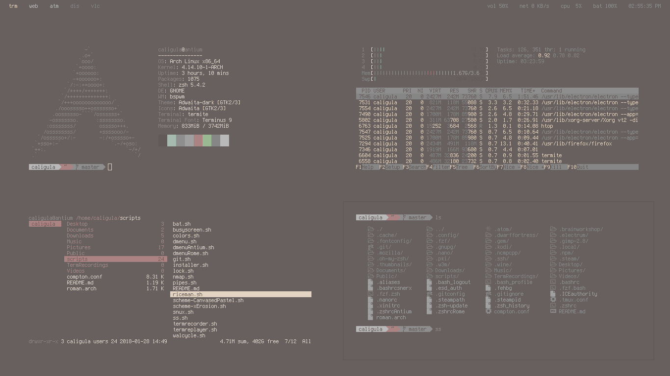
Unixporn - examples of riced unix interfaces.
Userstyles - custom CSS for any site; gets rid of white backgrounds.
Let's Enhance - image enhancer and upscaler.
Gigapixel AI - better image upscaler, but not free.
Nik.Bot.Nu - most robust wallpaper scrapper in terms of functionality.
Site Origin - wallpaper generator.
Color Theory
The Munsell color system, and a visual graph.
Paletton, Colormind, Terminal Sexy, Canva, and Coolors are all palette generators, but you could just generate a color scheme with AI instead.
Color blindness tests and schemes are important to check for.
ColorPsychology details the general feelings people associate with colors.
Color Hex and Color Conversion Algorithms are good for automating color discovery.
Palette Examples
Grayscale, Saturation, Ancient Fountain, Ancient Wall, Fake Art Deco, Art Deco Inlaid Wood, Citypop Tennis Court, Modern Ocean Orange, Vaporwave Anime
GuidebookGallery - visual history of operating system GUIs.
UI Elements - curated list of articles for how to design almost any UI element.
Graphagos - genetic algorithm AI used to generate user interfaces.
Unixporn - examples of riced unix interfaces.
Userstyles - custom CSS for any site; gets rid of white backgrounds.
Let's Enhance - image enhancer and upscaler.
Gigapixel AI - better image upscaler, but not free.
Nik.Bot.Nu - most robust wallpaper scrapper in terms of functionality.
Site Origin - wallpaper generator.
Color Theory
The Munsell color system, and a visual graph.
Paletton, Colormind, Terminal Sexy, Canva, and Coolors are all palette generators, but you could just generate a color scheme with AI instead.
Color blindness tests and schemes are important to check for.
ColorPsychology details the general feelings people associate with colors.
Color Hex and Color Conversion Algorithms are good for automating color discovery.
Palette Examples
Grayscale, Saturation, Ancient Fountain, Ancient Wall, Fake Art Deco, Art Deco Inlaid Wood, Citypop Tennis Court, Modern Ocean Orange, Vaporwave Anime